 |
Choosing Fabrics and Colorsby: Kathy Somers
|
|
Choosing Fabrics and Colorsby: Kathy Somers
|
![]()
![]() All
fabrics for general quiltmaking should be 100% cotton. They should have a
similar weight and thread count as muslin or broadcloth. Fabric that is woven
too tightly (as in sheets) or woven too loosely (as in gauzy fabrics) is not
suitable. Fabrics should be tested for colorfastness. New fabrics should be
washed before using and pressed so that the grain is straight. Recycled fabrics
or used clothes are fine as long as they show no signs of wear and are of a
suitable fabric. Old sheets, however, are usually not suitable as they are too
tightly woven for quilting.
All
fabrics for general quiltmaking should be 100% cotton. They should have a
similar weight and thread count as muslin or broadcloth. Fabric that is woven
too tightly (as in sheets) or woven too loosely (as in gauzy fabrics) is not
suitable. Fabrics should be tested for colorfastness. New fabrics should be
washed before using and pressed so that the grain is straight. Recycled fabrics
or used clothes are fine as long as they show no signs of wear and are of a
suitable fabric. Old sheets, however, are usually not suitable as they are too
tightly woven for quilting.
![]() Be
aware, as you choose fabrics and colors, that several things can affect how the
color 'reads' from a distance of a few feet. One is the 'sheen' or glossiness of
a fabric finish, which can often make fabrics appear lighter. Another is
metallic accents in a fabric, which can also cause the fabric to appear somewhat
lighter. The most important thing that can change the appearance of a fabric
from a distance is the interplay of colors within a fabric. For example, if you
look at a tiny red and green stripe from a distance, you will see almost a solid
gray. Many colors will affect each other in this way, so be sure to check the
fabric from a distance to make sure that it has the effect that you are looking
for.
Be
aware, as you choose fabrics and colors, that several things can affect how the
color 'reads' from a distance of a few feet. One is the 'sheen' or glossiness of
a fabric finish, which can often make fabrics appear lighter. Another is
metallic accents in a fabric, which can also cause the fabric to appear somewhat
lighter. The most important thing that can change the appearance of a fabric
from a distance is the interplay of colors within a fabric. For example, if you
look at a tiny red and green stripe from a distance, you will see almost a solid
gray. Many colors will affect each other in this way, so be sure to check the
fabric from a distance to make sure that it has the effect that you are looking
for.
![]()
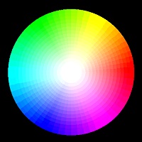
![]() Become
familiar with the color wheel at right and the placement of colors on it. Also,
become familiar with the color schemes below. This will help you to choose
colors for your quilt.
Become
familiar with the color wheel at right and the placement of colors on it. Also,
become familiar with the color schemes below. This will help you to choose
colors for your quilt.
![]() Often the best way, however, is to choose something (i.e. a picture or print
fabric) whose colors you like and make a color scheme from that.
Often the best way, however, is to choose something (i.e. a picture or print
fabric) whose colors you like and make a color scheme from that.
![]() Another
good way to choose a color scheme is to draw the quilt top on the computer or
graph paper and color it in with colored pencils till you get one that you love.
Notice that dark, cool colors seem to recede while light, warm colors tend to
advance toward you. Take note of the way that blocks placed side by side can
often create new secondary patterns when colored creatively.
Another
good way to choose a color scheme is to draw the quilt top on the computer or
graph paper and color it in with colored pencils till you get one that you love.
Notice that dark, cool colors seem to recede while light, warm colors tend to
advance toward you. Take note of the way that blocks placed side by side can
often create new secondary patterns when colored creatively.
![]()
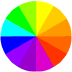
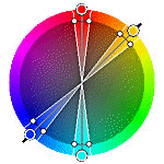
Color Theory is a set of principles used to create harmonious color combinations. Color relationships can be visually represented with a color wheel — the color spectrum wrapped onto a circle.
According to color theory, harmonious color combinations use any two colors
opposite each other on the color wheel, any three colors equally spaced around
the color wheel forming a triangle, or any four colors forming a rectangle
(actually, two pairs of colors opposite each other). The harmonious color
combinations are called color schemes – sometimes the term 'color harmonies' is
also used. Color schemes remain harmonious regardless of the rotation angle.
 |
Monochromatic Color SchemeThe monochromatic color scheme uses variations in lightness and saturation of a single color. This scheme looks clean and elegant. Monochromatic colors go well together, producing a soothing effect. The monochromatic scheme is very easy on the eyes, especially with blue or green hues. |
|
|
Achromatic Color SchemeThe achromatic color scheme uses variations in lightness and darkness of black, gray and white. This scheme depends on contrast. It also looks clean and elegant but produces a stark, harsh effect, often meant to portray surrealism. Sometimes just a dash of one color is added as an accent. |
 |
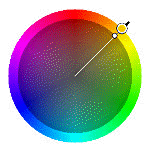
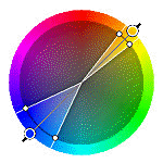
Analogous Color SchemeThe analogous color scheme uses colors that are adjacent to each other on the color wheel. One color is used as a dominant color while others are used to enrich the scheme. The analogous scheme is similar to the monochromatic, but offers more nuances (see below for an example). |
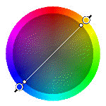 |
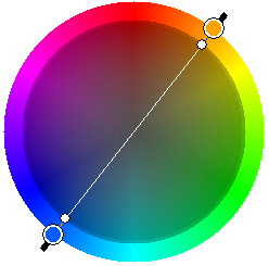
Complementary Color SchemeThe complementary color scheme consists of two colors that are opposite each other on the color wheel. This scheme looks best when you place a warm color against a cool color, for example, red versus green-blue. This scheme is intrinsically high-contrast (see below for an example).. |
 |
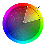
Split Complementary Color SchemeThe split complementary scheme is a variation of the standard complementary scheme. It uses a color and the two colors adjacent to its complementary. This provides high contrast without the strong tension of the complementary scheme. |
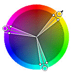 |
Triadic Color SchemeThe triadic color scheme uses three colors equally spaced around the color wheel. This scheme is popular among artists because it offers strong visual contrast while retaining harmony and color richness. The triadic scheme is not as contrasting as the complementary scheme, but it looks more balanced and harmonious. |
 |
Tetradic (Double Complementary) Color SchemeThe tetradic (double complementary) scheme is the most varied because it uses two complementary color pairs. This scheme is hard to harmonize; if all four hues are used in equal amounts, the scheme may look unbalanced, so you should choose a color to be dominant or subdue the colors. |
| (All of the above) |
Polychromatic Color SchemeThe Polychromatic Color scheme is made up of many different colors (i.e. scrap quilts). Paradoxally, it is one of the easiest color schemes to balance. There are no rules with this scheme. The more colors, the more balanced and harmonious the effect.. |


![]()
 Primary
Colors:
Primary
Colors: Secondary
Colors:
Secondary
Colors: Tertiary
Colors:
Tertiary
Colors:![]() Please
note that good color schemes are rarely made from the simple hues of each color.
For example, the popular color scheme of pink and green is actually a
complimentary color scheme using a tint of red (pink) and tones of green
(usually sage or mint). The popular combination of blue and peach are actually a
tone of primary blue and a tint of orange. When choosing a color scheme, look
beyond the simple hues and consider variations of the colors in question.
Please
note that good color schemes are rarely made from the simple hues of each color.
For example, the popular color scheme of pink and green is actually a
complimentary color scheme using a tint of red (pink) and tones of green
(usually sage or mint). The popular combination of blue and peach are actually a
tone of primary blue and a tint of orange. When choosing a color scheme, look
beyond the simple hues and consider variations of the colors in question.
For further information, contact:
KathKwilts@KathKwilts.com
![]()
This page has been visited times since 1/6/00.
[Click HERE for LIVE Chat NOW!!!]
[ChanOps]
[Chat]
[Stats] [Schedule] [SuperChats]
[Lessons] [Links]
[Send a Quilty Postcard to your
Friends!!!]
![]()